Erich W. Schienke -- Final Project for GIS in the Sciences - ERTH6961
Mapping of Breast Cancer Death Rates Across the US, particularly as it correlates to data from the 1999 Toxic Release Inventory (TRI)
This project's main purpose was to investigate if there is a spatial correlation between breast cancer death rates and toxic release output.
The first step was to obtain the breast cancer death rate data from various data sources http://www.nationalatlas.gov, http://www.cancer.gov/, and http://www.mapcruzin.com.
The smallest unit of analysis this data came in was by county, and this was, for some reason, only by white female. Black female data was by state and by SEA code but not by county. I decided to see what breast cancer data looked like on its own, primarily to see if there were any clusters or "hot spots". The problem with looking only at the level of counties is that the scale is too big to determine any specific (point source) causes. Nevertheless, I feel there is value in trying to determine if there are trends in breast cancer death rates on a larger scale in the US, particularly as it relates (or not) to a community's toxic load.
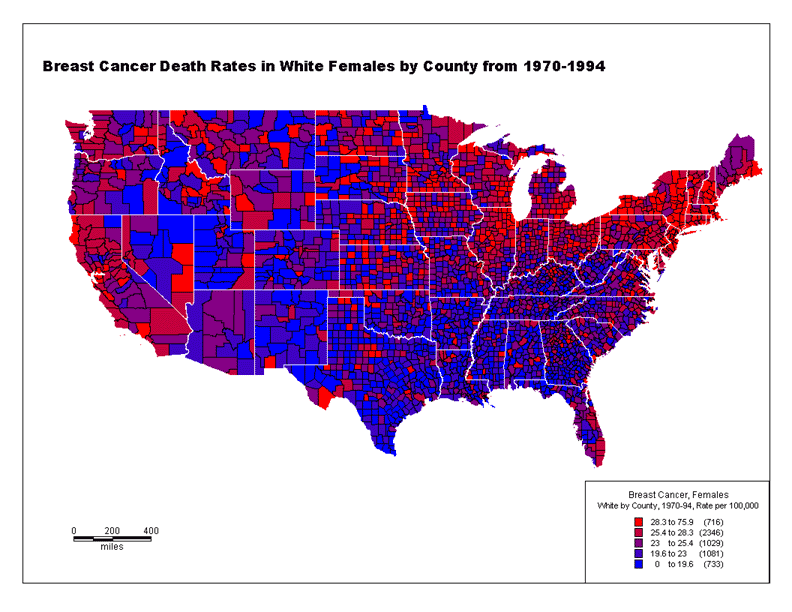
Map 1. This first map demonstrates breast cancer death rates per county. (These rates are count per 100,000.) There are 2200 counties accounted for here.
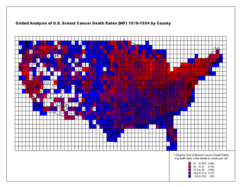
Map 2. The above map demonstrates what counties are "hotter" than others in terms of death rates. However, it doesn't do a very good job of demonstrating larger scale clustering. This next map divides the continental US into a 1 degree grid, where larger scale clustering becomes more apparent. This is interesting because it shows very few bright red areas in the middle of blue areas, a purple area is at least adjacent.
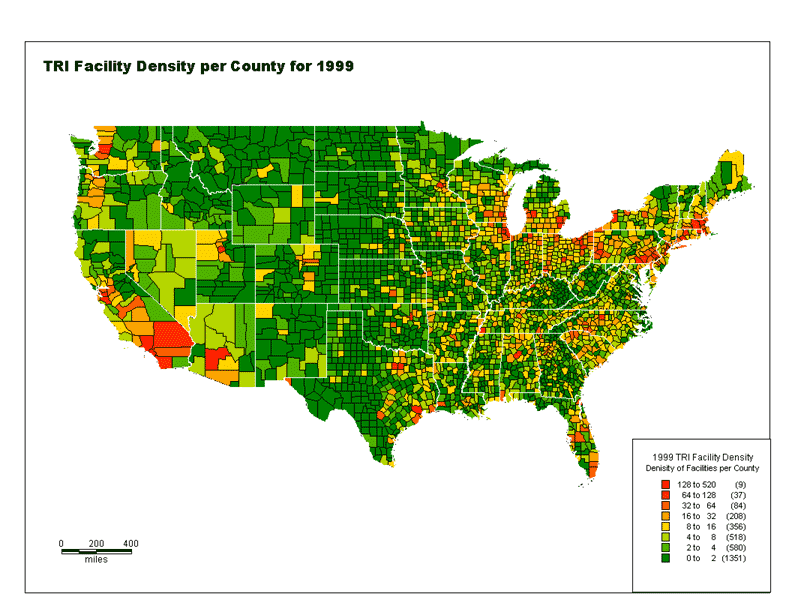
Map 3. The next step was to obtain data from the Toxic Release Inventory in shape file format (http://www.mapcruzin.com). This data came with co-ordinates from each source. There are studies that have demonstrated the relatively high inaccuracy of the Lats. and Longs. that are submitted with this data. However, at least these facilities are much more accurate in the reporting of their county. This, along with the fact that the breast cancer data only came at the county level made me limit the analysis and combine all TRI data at the scale of the county. Map 3 is the number of TRI facilities per county. A higher number in a county may be due to being located in a large county. However, a large portion of the dense TRI counties are relatively small. As well will see in Table 1. there is a high correlation between facility density and population.
Map 4. This map is based on the sheer output of chemicals in the TRI per county, regardless of the level of toxicity. This is indicative of a community's toxic load. Many of the counties in Nevada and Nex Mexico seem to be so hot because of the relatively high volume output levels due to mining, but these are areas of rather low population density. What is interesting is the difference between number of facilities and sheer output volume. Just because there are many facilities located in a particular county does not mean there will also be a high output rate.
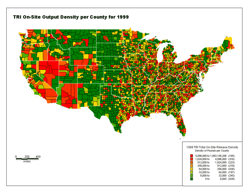
Table 1. This table was produced to investigate where correlations might exist between breast cancer death rates, counts, and projected counts in the future. That this projected (Ecountwf) count relates highly to current count allows for me to use data from 1970-1994 as it relates to current (1999) TRI data. I noticed a relatively high (.7319) correlation between facility count and death count (not rate). However, I figured this was more of a result of population density per county more than anything else. So, I went out and found the 1999 estimated population data by county (http://www.census.gov) and found a fairly high correlation between population count, facility count and death count. Therefore I would have to assume that the three were related, primarily based on population density. The correlation between TRI output and death rate was quite insignificant (.00413), that is, a high TRI output in the county did not correlate to a high breast cancer death rate. I also ran regressions on this data, produced scatter plots. It ended up showing a flat slope, i.e. no strong correlation at all.
| Correlation |
FACILITY_COUNT |
TOTAL_RELEASE |
TOT_REL_TRN |
Ratewf |
Countwf |
Lbwf |
Ubwf |
Lwf_uus |
Lus_uwf |
Ecountwf |
_7_1_1999_Estimate |
_7_1_1998_Estimate |
| FACILITY_COUNT |
1 |
|
|
|
|
|
|
|
|
|
|
|
| TOTAL_RELEASE |
0.077201474 |
1 |
|
|
|
|
|
|
|
|
|
|
| TOT_REL_TRN |
0.228437132 |
0.975168948 |
1 |
|
|
|
|
|
|
|
|
|
| Ratewf |
0.232983466 |
-0.004135073 |
0.031376927 |
1 |
|
|
|
|
|
|
|
|
| Countwf |
0.731941588 |
0.036919316 |
0.137138669 |
0.254850399 |
1 |
|
|
|
|
|
|
|
| Lbwf |
0.369845084 |
0.007586189 |
0.0630855 |
0.854768951 |
0.361110453 |
1 |
|
|
|
|
|
|
| Ubwf |
-0.011314659 |
-0.006318832 |
-0.007422909 |
0.784448698 |
0.038077537 |
0.358545464 |
1 |
|
|
|
|
|
| Lwf_uus |
0.369840209 |
0.007585355 |
0.063083612 |
0.854769501 |
0.361124341 |
0.999999675 |
0.358544359 |
1 |
|
|
|
|
| Lus_uwf |
0.011325158 |
0.006324469 |
0.007429779 |
-0.784448901 |
-0.03806916 |
-0.35854533 |
-0.999999872 |
-0.358544227 |
1 |
|
|
|
| Ecountwf |
0.752805933 |
0.043892289 |
0.147689779 |
0.242206411 |
0.996652452 |
0.361748538 |
0.014533547 |
0.361761675 |
-0.014525136 |
1 |
|
|
| Population_7_1_1999_Estimate |
0.873416689 |
0.068485827 |
0.194233922 |
0.219336819 |
0.843851271 |
0.351799093 |
-0.015024587 |
0.351805765 |
0.015034279 |
0.871002682 |
1 |
|
| Population_7_1_1998_Estimate |
0.875398936 |
0.068717901 |
0.1948283 |
0.220454913 |
0.84600156 |
0.352815195 |
-0.014193687 |
0.352821591 |
0.014203314 |
0.872830654 |
0.999950388 |
1 |
|
|
|
|
|
|
|
|
|
|
|
|
|
|
|
|
|
|
|
|
|
|
|
|
|
|
| DATA FIELD DEFINITIONS |
|
|
|
|
|
|
|
|
|
|
|
|
| FACILITY_COUNT: Number of TRI facilities in the county |
|
|
|
|
|
|
|
|
|
|
|
| TOTAL_RELEASE: Total release per county in pounds of chemicals |
|
|
|
|
|
|
|
|
|
|
| TOT_REL_TRN: Total release on and off site per county in pounds of chemicals |
|
|
|
|
|
|
|
|
|
|
| COUNTY: 5-digit FIPS code |
|
|
|
|
|
|
|
|
|
|
|
|
| RATEWF: mortality rate per 100,000, age-adjusted to the 1970 US population |
|
|
|
|
|
|
|
|
|
|
| COUNTWF: number of deaths |
|
|
|
|
|
|
|
|
|
|
|
|
| LBWF: lower bound of the 95% confidence interval on the mortality rate |
|
|
|
|
|
|
|
|
|
|
| UBWF: upper bound of the 95% confidence interval on the mortality rate |
|
|
|
|
|
|
|
|
|
|
| LWF_UUS: LBWF - upper bound of the 95% confidence interval on the US mortality rate |
|
|
|
|
|
|
|
|
|
| LUS_UWF: lower bound of the 95% confidence interval on the US mortality rate - UBWF |
|
|
|
|
|
|
|
|
|
| ECOUNTWF: expected number of deaths based on US rates |
|
|
|
|
|
|
|
|
|
|
|
|
|
|
|
|
|
|
|
|
|
|
|
|
|
|
|
|
|
|
|
|
|
|
|
|
Map 5a and 5b. Even though, at the county scale, there is no strong correlation between output volume and breast cancer death rates, I did think it would be useful to still be able to see the counties that do show high rates in both categories. In addition, it is useful to be able to quickly see where there is little or no correlation between the two, i.e. where there may be high death rates with low output. The top map (5a) is a bit too dense to demonstrate how this map can be useful. The enlarged portion (5b) shows a scale where the map is more readable.
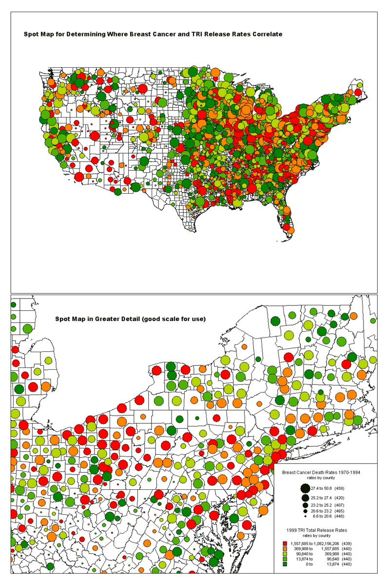
Conclusion. This project demonstrates that there is no strong correlation between a county's white female breast cancer death rate and sheer output volume of toxics. This does not mean, however, that knowing where the two correlate (particularly on the high end) is not useful. The final map (Map 5a and 5b) becomes helpful in seeing the counties where such a correlation does occur.